There’s so much going on across Canada this week, but the biggest news on everyone’s minds here in Ontario is that our provincial government and our health experts now agree that the first wave of our current outbreak of COVID-19 has “likely peaked.”
Since we, as a family, are more directly connected to what’s happening in health care right now than some folks, I’ll try to provide some context from that perspective. Most people are pretty familiar with the two metrics we hear about repeatedly in the media…who’s getting sick, and who’s dying. While charting those statistics out can be productive for policy decisions, it’s not always the best way to maintain an immediate understanding of what’s happening on the so-called “front lines” at our hospitals.
Every country around the world, and every province across Canada, is testing and measuring COVID-19 cases and deaths a little bit differently. That’s partially due to planned strategy, and partially due to tactical reality, and it’s going to be quite some before we gain a truly consistent view of how one jurisdiction compares to another. What perhaps best measures day-to-day emergency health care delivery, though, isn’t either of those numbers…directly.
If you think of COVID-19 cases as an “input” to a complex and ever-changing equation, the relentless “output” of that equation to be most concerned about is the pressure placed on our critical care capacity. We hear a lot, in abstract terms, about the number of available ICU beds and ventilators being important. We’ve see on the evening news what it looks like when, in epicentres like Italy or New York City, hospitals are overrun and their capability to provide effective care for patients is strained, then degrades, and finally catastrophically fails.
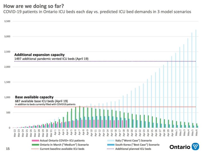
Earlier this month, there was a press conference at the University of Toronto in which the province laid out the best predictions it could based on available data, giving the public sobering and unprecedented transparency into why physical distancing and economic sacrifices were increasingly necessary. Now, several weeks later after having rapidly expanded our ICU capabilities in every way possible, the province has released new information indicating a potential “peak” and shared what updated computational modelling now sees further ahead:

Nearly everyone in the province has probably seen this slide by now, you can even download the whole deck from this week’s press conference, but based on conversations I’ve been having the government and the media have not been doing an optimal job of explaining what it represents. I’ll take my best shot, but please bear in mind that I’m just a dad (and an ad hoc schoolteacher) and my spouse is the one with all the advanced degrees.
The first thing to say is that if it looks to you like things have gone far “better” than expected (positive language on this topic coming with a lot of caveats) well, you’re right. They have. Somewhat frustratingly, there’s even been some immediate feedback that this somehow shows we’ve “overdone it” and probably shouldn’t have been so “extreme.” I can understand why some people would feel that way. I want to unpack that sentiment a little bit.
In the past few weeks, not only health care workers, but nearly every person across the province has, in some way, contributed to a herculean effort to prepare for this outbreak. I can’t even begin to list the ways in which parents and children, business owners and employees, or doctors and nurses have had to fundamentally change their lives (often at great personal cost). I know there are a lot of raw nerves right now. Many people probably feel, frustratingly, that their family’s unique sacrifices are invisible to others.
Those sacrifices are not invisible.
They are the very reason that this chart looks the way it does. They are the reason why there aren’t four dozen refrigerated semi-trucks for storing bodies parked outside Toronto’s hospitals right now the way there were in New York City last week (where my mom’s friends lost at least six family members). They are the reason our health care system is still functioning, unlike some European population centres that are struggling right now just to recover basic service delivery. It wasn’t just because of hail mary equipment donations, it wasn’t just because of any one specific political policy, and it definitely it wasn’t because we “got lucky.” It was because of what Canadians from all walks of life did…because of their shared concern for each other.
Everyone in Ontario should take a moment to look at that chart, and feel proud.
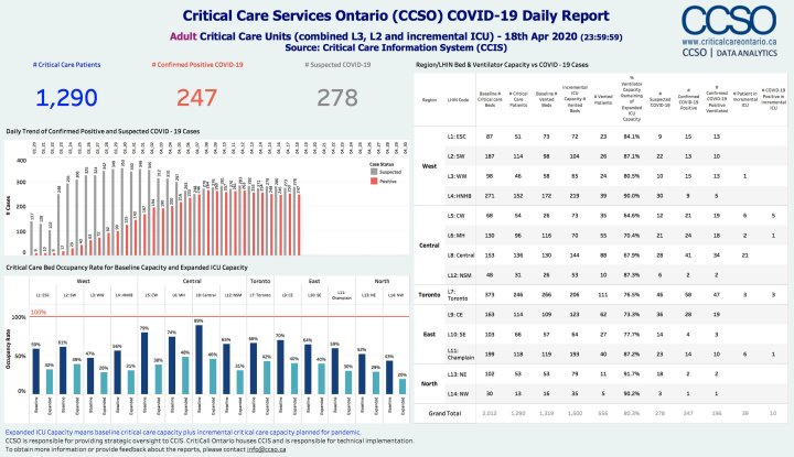
There is another chart that’s worth looking at though, and it wasn’t in the press package that day. It’s an internal report for the Critical Care Services Ontario, that shows at a more granular level what’s going on with our ICU capacity. It’s not something that’s typically public and you won’t find it on the CCSO web site, but if you follow Dr. Jennifer Kwan on Twitter she shares a lot of dashboard stats like these:

Those numbers were tabulated as of midnight, the night before the day the aforementioned slide deck was prepared. It shows the same situation, but as a snapshot of a given moment instead of as a trend over time. Notice, when you drill down, and look at “baseline” and “expanded” capacity independently, how our ICU capacity is actually operating right now while caring for COVID-19 patients. Also bear in mind that under normal, everyday conditions (when people aren’t social distancing or staying home from potential ER trips) the original “baseline” utilization can be very near 100% at many locations.
That first slide, the one we all saw on TV, does a good job of showing that we’ve exceeded the expectations of not only our worst-case, but also our best-case scenarios as we attempted to plan for this moment, several weeks prior. A single day’s detailed snapshot, however, shows us how unprepared we are, right now, to simply shift things “back to normal.” I’m not even talking about the local economy, or international business, or the school system…for the time being I’m just talking about the everyday functioning of our hospitals.
Right now, the “expanded” capacity that’s represented on both diagrams is made up primarily of resources that were already needed elsewhere in the health care system and have been, for lack of a better term, borrowed…and that over-extended library loan is going to come due soon. It’s true, a small portion of that capacity reflects new temporary structures and field units such as the huge tent that just went up down the street from us, outside Joseph Brant Hospital, but that’s definitely not the whole story.
Much of that additional ICU capacity consists of buildings, rooms, beds, equipment, and yes…people eventually urgently needing to be someplace else, or doing something else, and all those “something elses” were already crucial to the normal functioning of our province’s health care system before all this began. Starting as soon as next week, some portion of those resources will, by necessity, start returning to or at least sharing their traditional functions as we reopen health care across the province for more typical uses (including a scheduled surgery load that was several months deep before the pandemic).
It is important that we all recognize what an achievement this has been. It is equally important that we all recognize that this is not the beginning of the end. Quite the opposite, this could be more aptly called the end of the beginning.
We have “flattened the curve” for now, but the measures we have expended to do so are by their nature as ephemeral as they are improvised, and the curve won’t stay flat by itself. It falls to all of us now to collectively figure out how we navigate the rest of the pandemic from here on in.
On the bright side, pharmaceutical problem-solving has been going on around the clock and around the world in parallel with all this clinical response, and there are already better viral tests, better antibody tests, and vaccine candidates moving into the trials and studies that will be necessary before we can add them to our arsenal in the fight. Just this morning, the Prime Minister announced more than a billion dollars is about to be injected into efforts towards such “scientific strategy.”
None of those tools are ready for prime time yet, though, and won’t be soon.
Therefore, the primary weapon we’ve got at this point is still physical distancing, loathe as we all are to keep dealing with it. Without medicine to keep us from getting sick, and without medicine to help us get better, good old fashioned isolation is the only proven-effective method we have right now to slow the spread and keep our resulting critical care usage flat.
If we want to start “reopening” our province outside the hospital doors, we’re going to need to do two things, neither of which are easy. First, we need to commit to dramatically and semi-permanently increase our capacity to test and care for COVID-19 patients, and second we need to keep coming up with more and more inventive ways to allow the mechanisms of our society to function while most of us have to remain apart.
On that last note, I’m looking forward to sharing some nifty innovations I’ve come across right here in our area recently, so expect a decidedly more upbeat post soon…about food and beer! Until then, best wishes and good luck, wherever you are.

